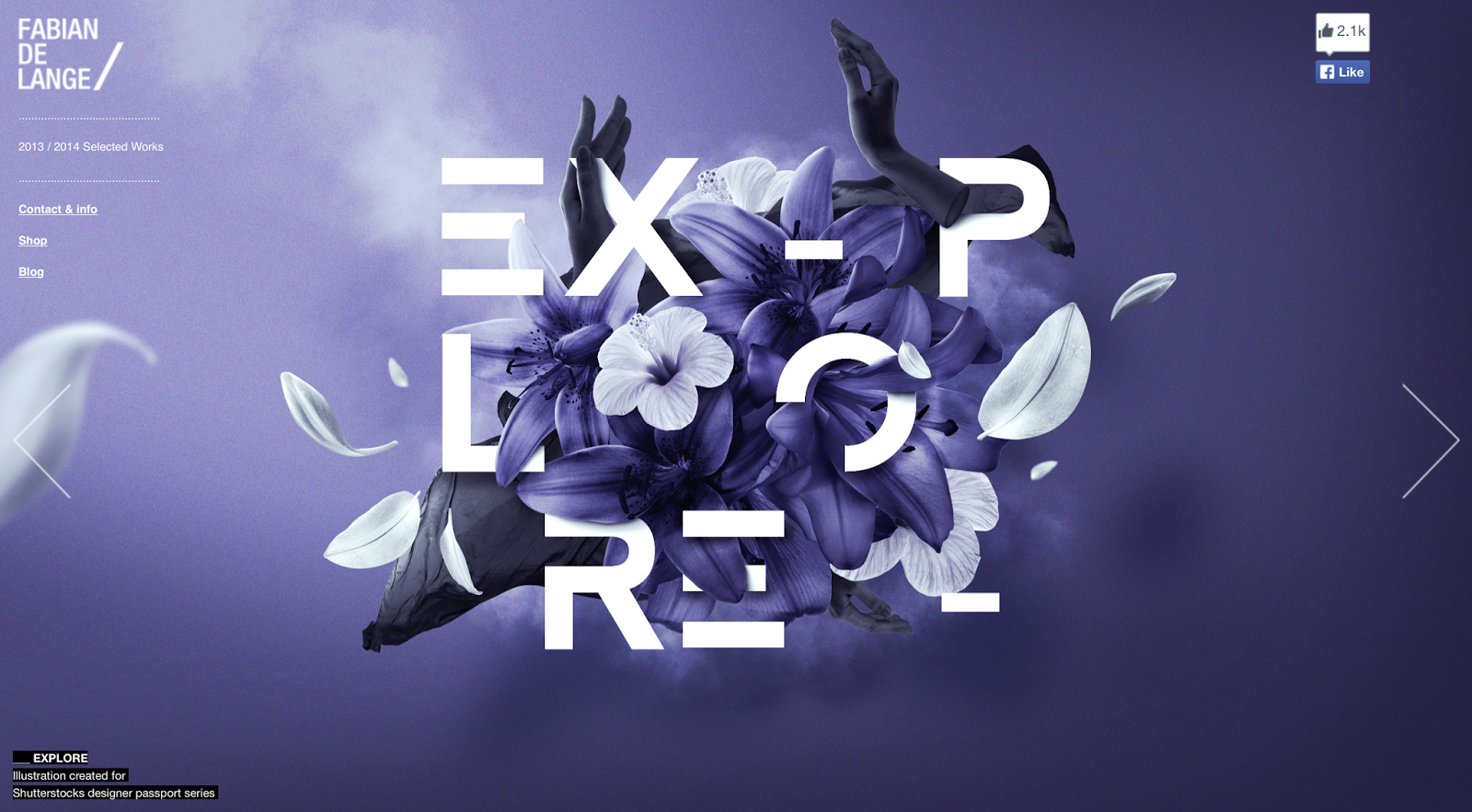
De lange is a free lance multidisciplinary graphic designer who specialises in typography, his work is bold and unique using colours that pop out of the page to make the image come to life.
He uses layering techniques on his images to that it adds depth to an image to make it feel more alive, by making background images and foreground images come together.
I like the way in which which he does this purely for ascetic reasons i think by intertwining each section, whatever has been made looks full of life.
Fabian De Lange is one of the tipping points for my work he is the style that I wish to incorporate into my final piece, he merges together typography, rich colours and imagery of things that either have meaningful ideologies positions or are just used to give the image depth.


No comments:
Post a Comment